Owners Dashboard
The current owner's dashboard had been created as a place to house links to other information, and promotional content. I took it upon myself to work with a small team to rebuild and design this page to be more functional, surfacing more important information to the dashboard.

PROJECT
BRIEF
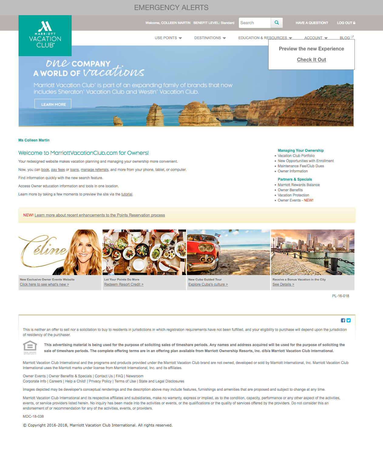
When a timeshare owner logged into owners.marriottvacationclub.com they were presented with a homepage that acted as a sitemap to other sections of the site, with information repeated or missing. I undertook the effort to take the most searched for and visted pages and information and create a unified dashboard.
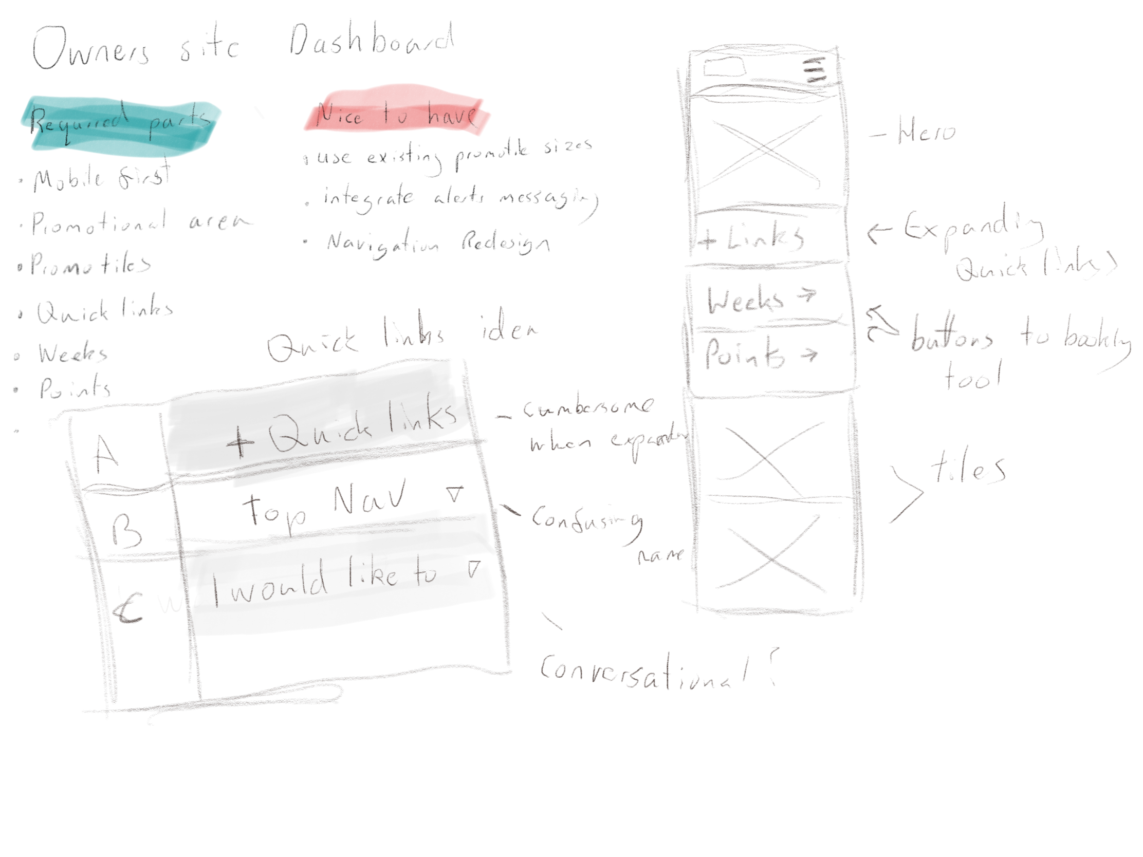
SKETCHING
I put together a small group to brainstorm requirements and present what information is most needed on the dashboard as well as what information was the most searched for. It became clear quickly that the frequent links would need to be addressed due to other architecture issues with finding information. I quickly took a few notes on how to present this information in a more friendly tone, opting to change the list of links that existed into a streamlined dropdown titled "I would like to"
CONCEPTING
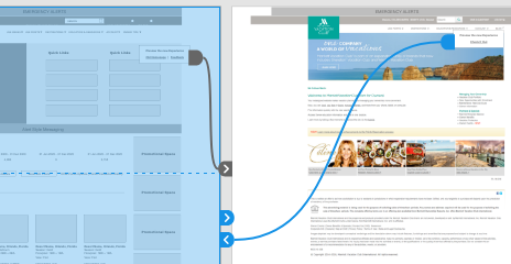
Taking a screenshot of the old page as our baseline, I worked with a Product manager and IA to create a checklist of items and items we wanted to test, as well as adding a "Preview" button to act as a soft launch for users.

MOBILE FIRST
Taking all the elements I had sketched I created a simple mockup in Sketch of what blocks we would need
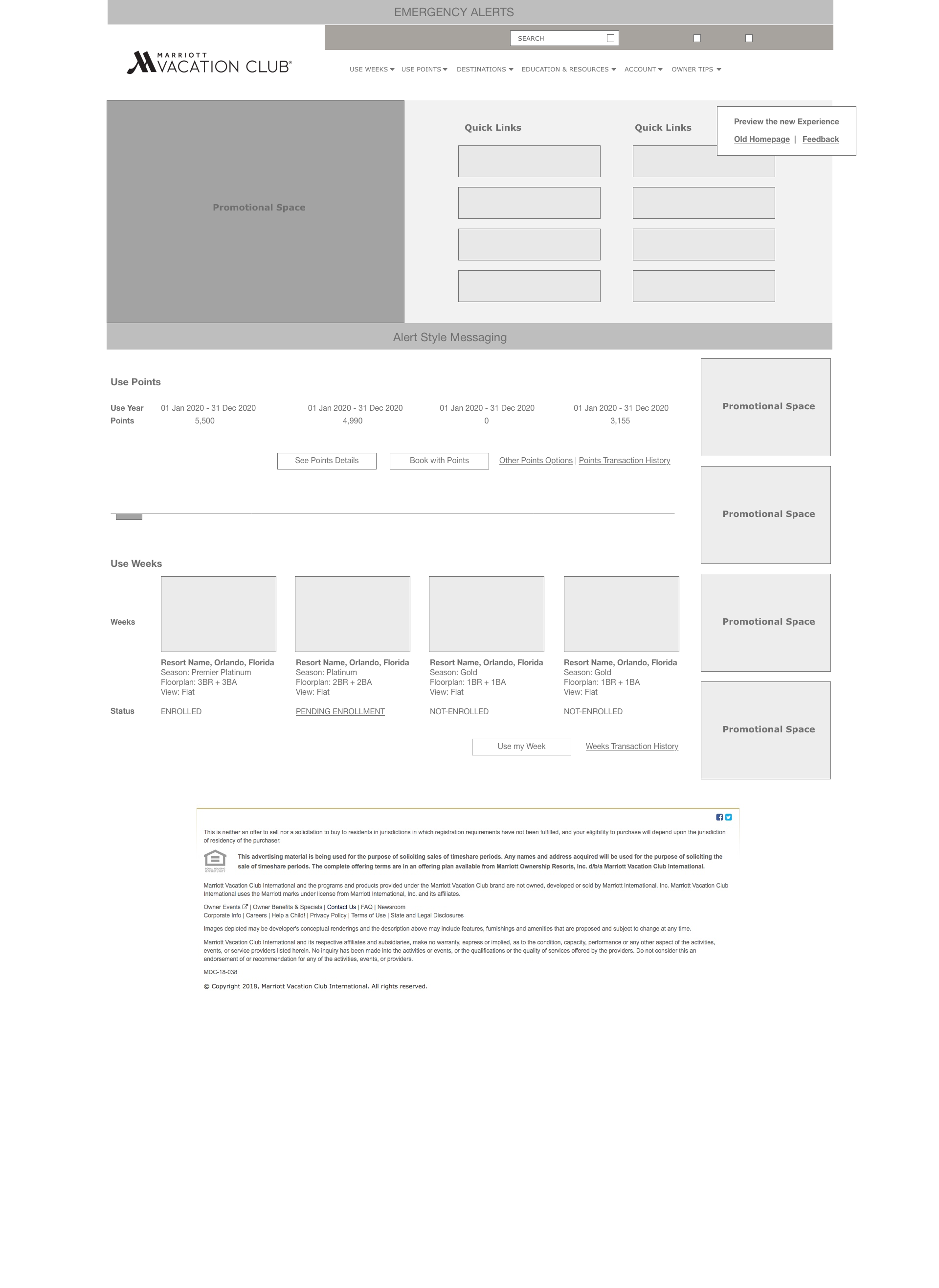
Emergency alerts would be above all content
Promotional space would match the dimensions of the existing site allowing for cross image use
Alert messaging would flow under the promotional images (items like bill due)
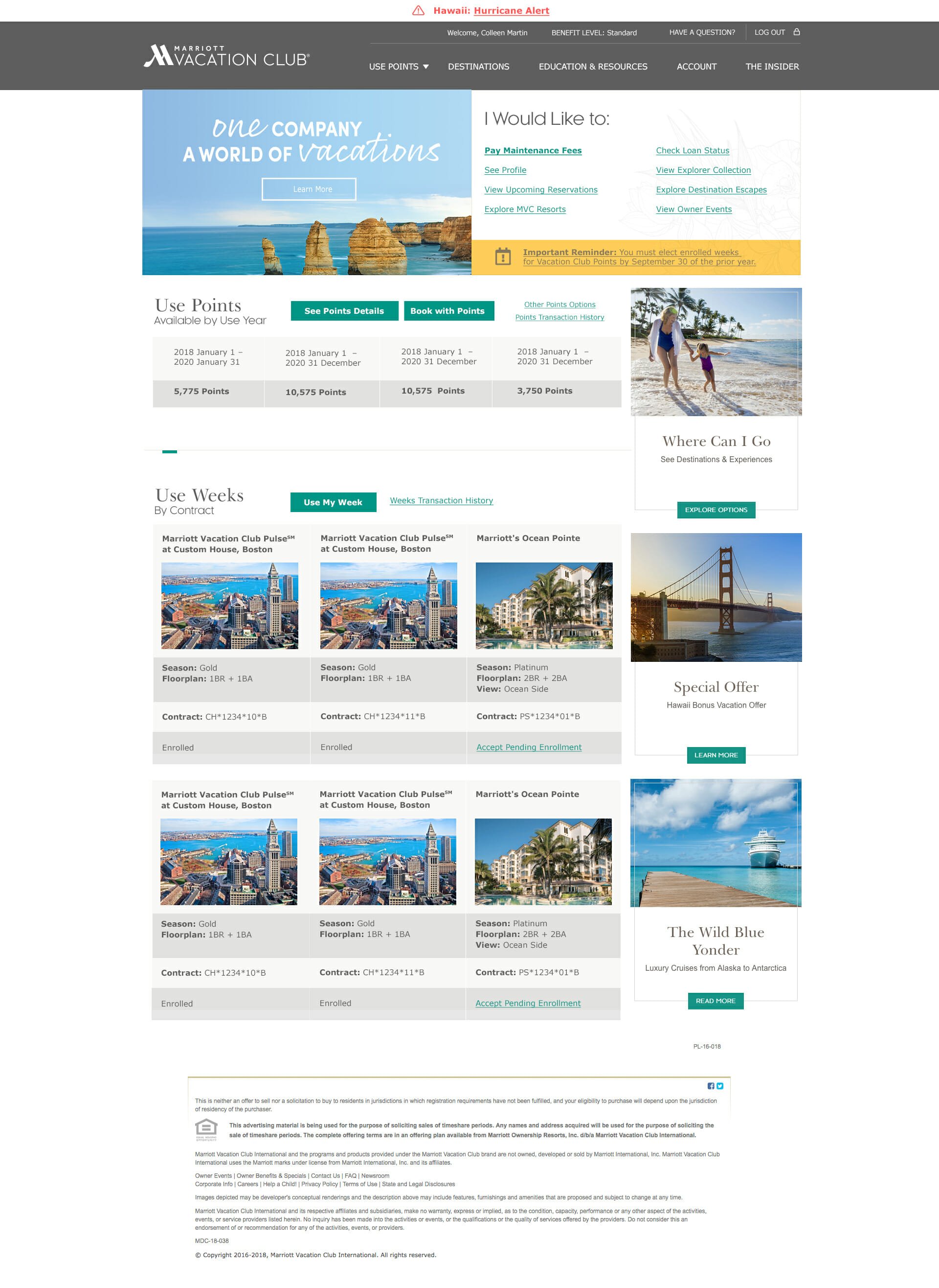
The rest of the page is the content, allowing the user to see their ownership at a glance and take action on it
(Desktop mockup below)
PROTOTYPING
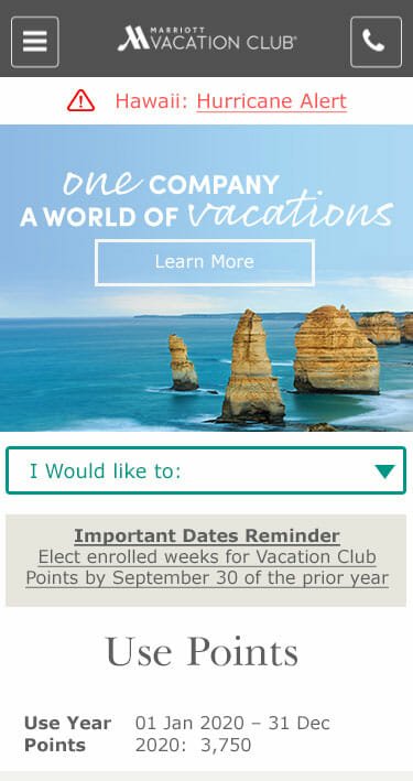
Once I had a valid concept I created a prototype in Adobe Experience Designer, that was user validated and iterated upon before any design work took place. Here we decided rather than creating a new page, we could leverage one of the account level pages which allowed our development timeline to be drastically shorter and to move the step that identified an owner to the homepage allowing the rest of the site to function knowing the owner type rather than presenting generic information as it had done before.

DESIGN
Using brand colors and existing styles, these pages were built to replicate as much as possible the existing experiences allowing them to flow better with the site and take advantage of all testing being done on table layouts, button shapes and colors.
Selected Works

Welcome SiteUX/UI, Wordpress Theme development

Q-Telematics DashboardTelematics

Compass BlogWordpress Themes UX/UI

Marriott Re-BrandingUX Design
